Heads up! I am developing exclusivly on firefox with a 1920x1080, a 1280x1024, and a 1440x900 monitor. This is still under construction, so other browsers or extreme aspect ratios might not function as intended.
Hello!
"The other voids aren't satisfying to scream into, better make my own."
- Me when I spent money for the web domain and hosting
Have a look around!
Welcome!
I am Thomas, a computer science major currently attending college in North Carolina. My experience in programming started freshman year of high school where I learned JavaScript. After that introductory course I self-taught HTML/CSS in order to use my JavaScript outside of code.org. I enjoy making technical tools for videogames and made this place to share those projects!
I am passionate about computer literacy. While I may not pursue a career in computer science education, it is something I enjoy. I plan to add tutorials and small lessons on intresting subjects I find to my projects page. I might occasionally also add blog posts about ideas, armchair philosophy, crazy dreams, or cautionary tales. Please contact me for any reason, im always happy to get emails!
The Banner
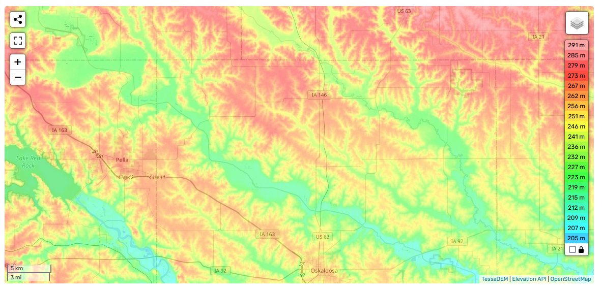
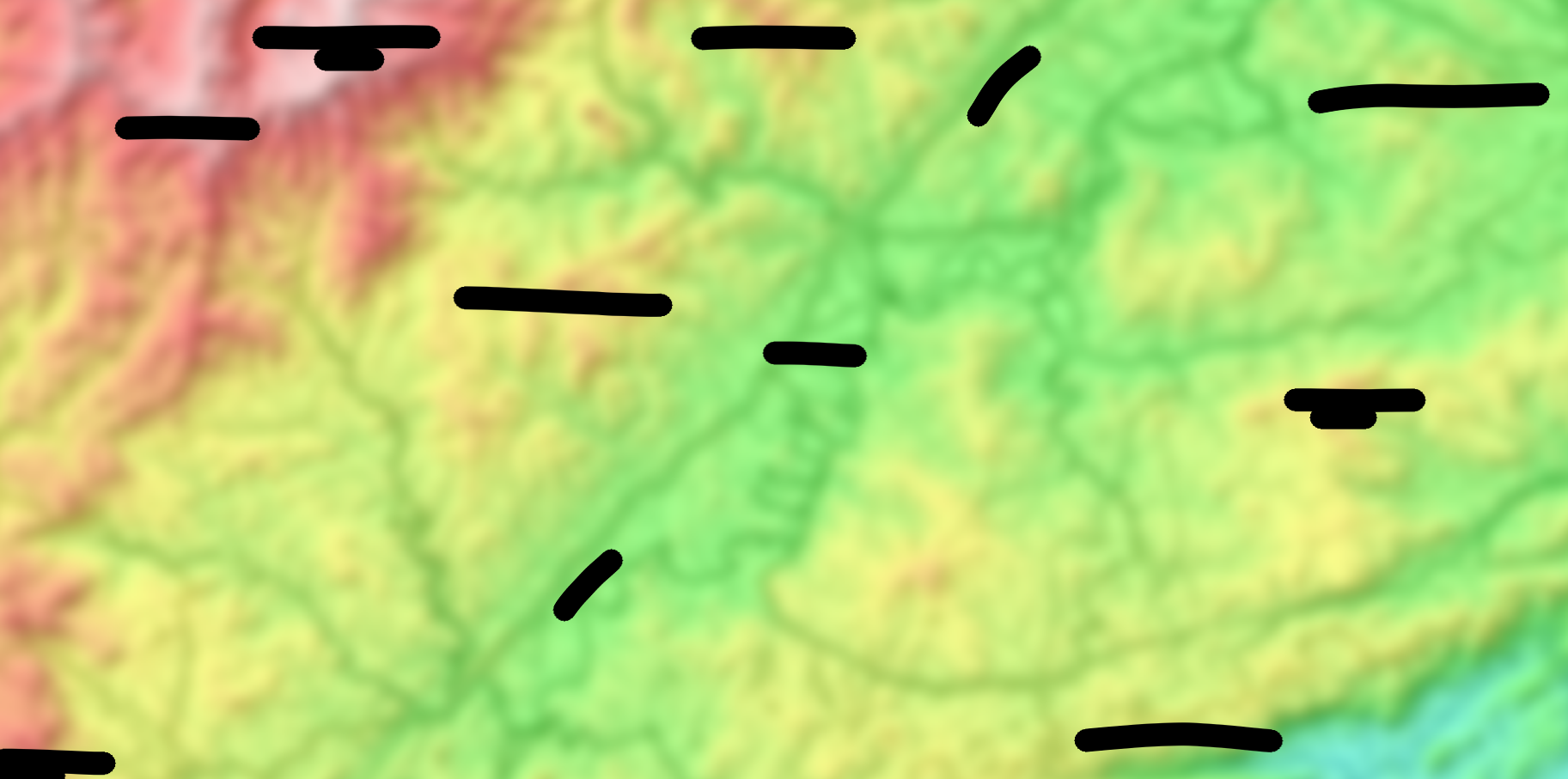
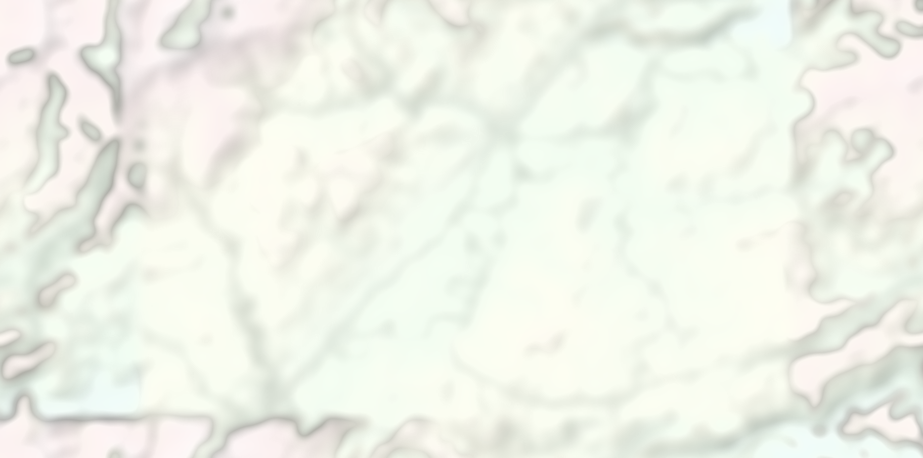
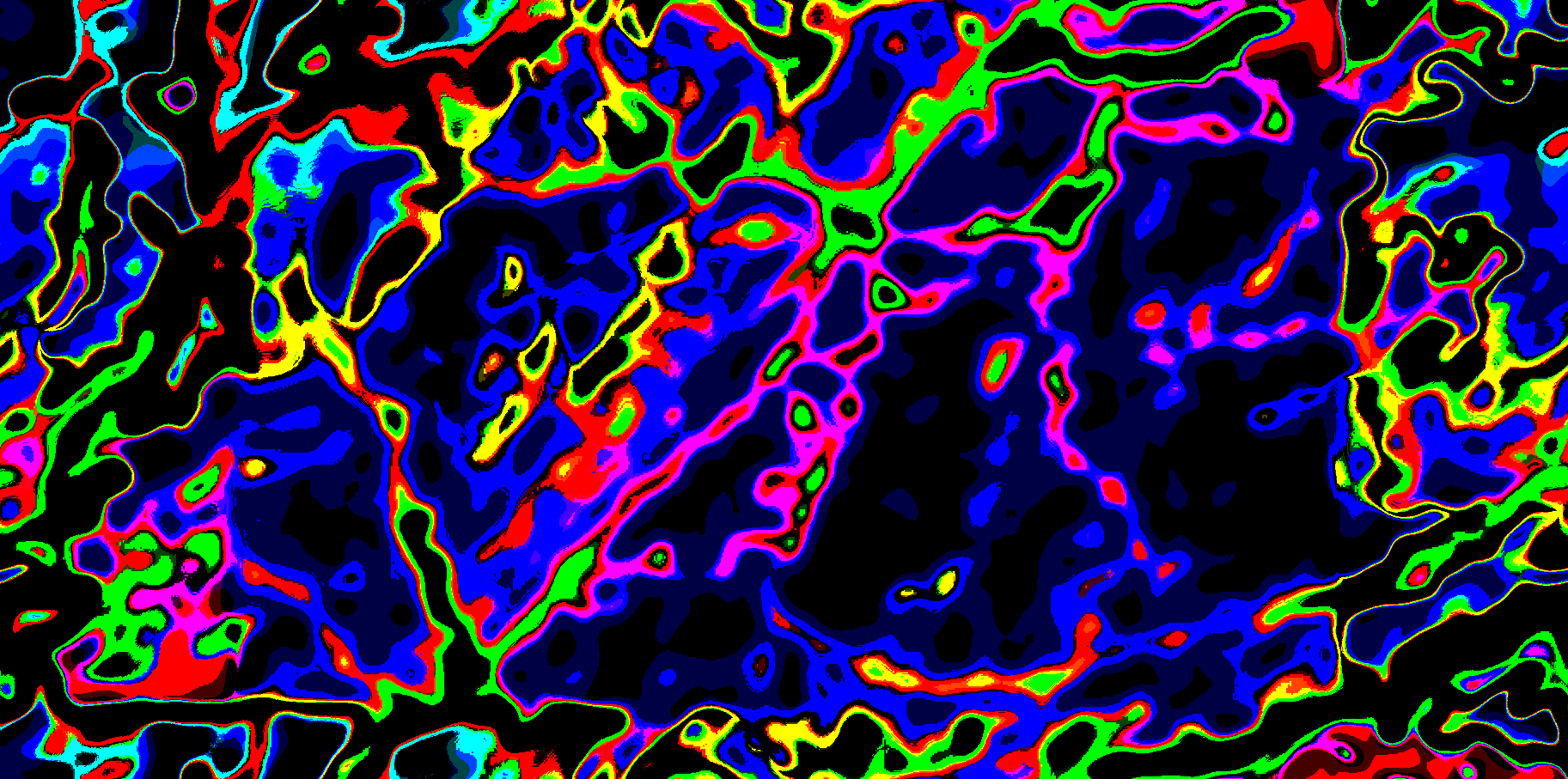
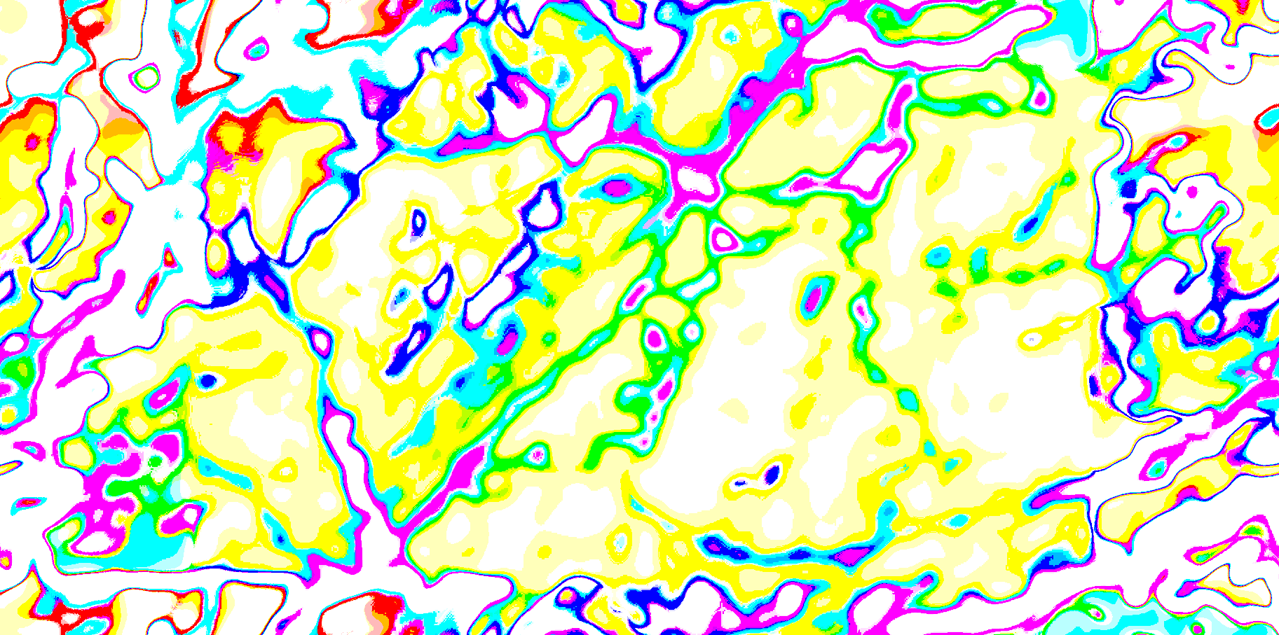
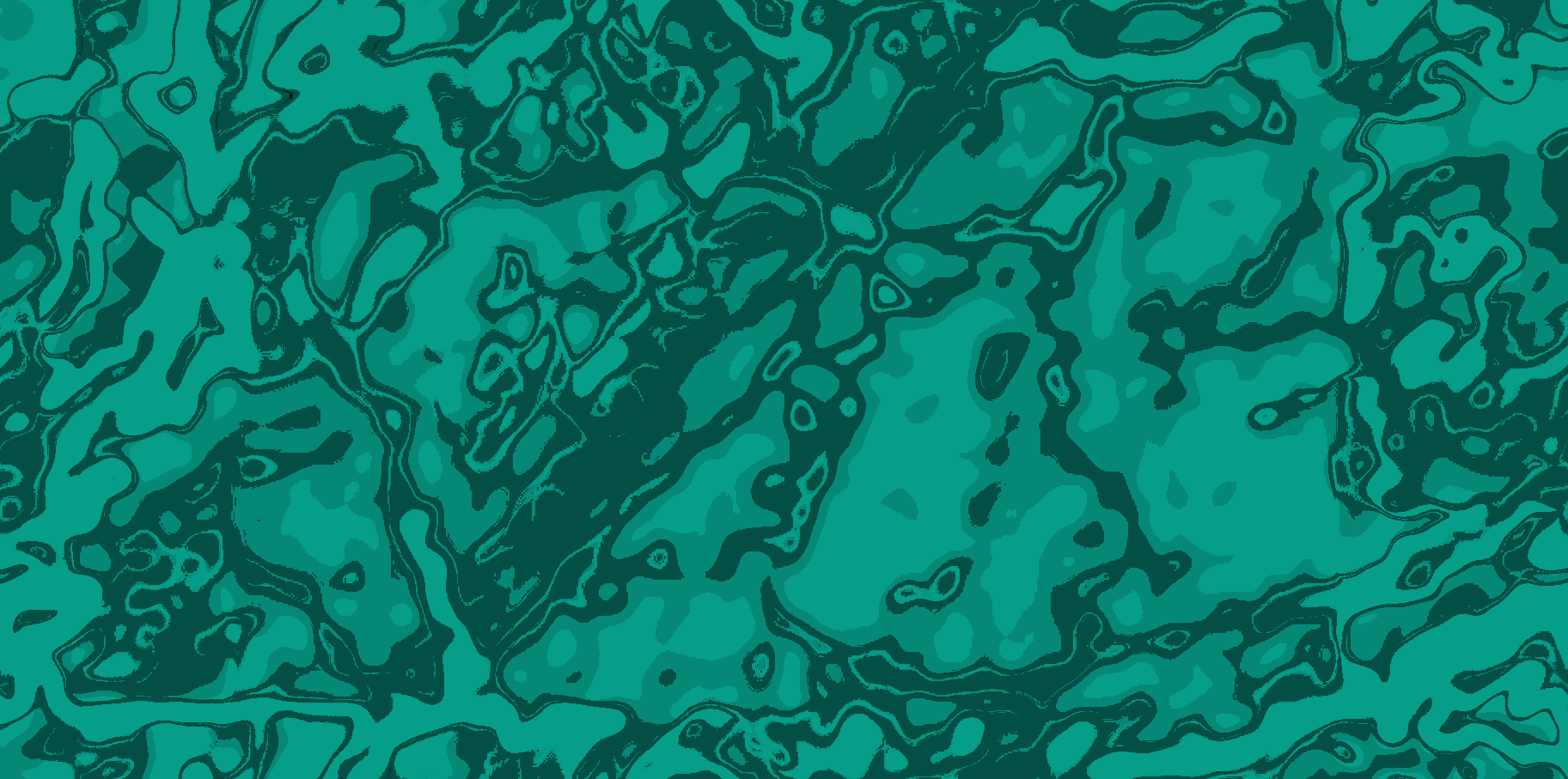
The banner for my homepage is actually an image of my hometown's topology! I zoomed out a little, destroyed the color curves, sent it to black and white, and then colorized it. I am very lucky and proud to live in the mountains and am happy that this turned out so well. I think that we can create so much cool art from patterns we find from nature. I did all this in Affinity Photo 2! Here are the progress steps, hover for more details:

I took a screenshot of my hometown from a website that displays topographic maps. I had to play around with scale and locking the elevation key to get some intresting contrast. This screenshot here is from Iowa (not my hometown).

Adding blur will give the final result its bubbly texture. More or less blur can adjust how detailed the areas of color are at the end. I used a guassian blur with an 8px radius. The black bars are so I don't dox myself. Fun fact, guassian blurs are non-destructive and can be reversed. The only data lost is on the edges of the image!

I added the black and white filter on a whim, but it turned out to be very important for the next step. This filter is applied at 89% opacity with some small tweaking done to the indiviual colors effected.

The real changes happen when you screw up the color curves. Adding a curve modifier and changing the linear curve to a very sharp square spike will create the sharp lines between colors. You can adjust the location of the square peak to get different patterns and variety of colors.

If we just colorize it without inverting the colors we get a dark mess. The color inversion, or high contrast mode, will let the colorization control more of the end result.

The last step is to just recolor your result. I went for a medium cyan color because that was the theme I wanted to use for my website. Loads of different colors here will look good.
The Name
The word "tmkop" comes from a combination of my initials and a recognizable part of a local store. The oldest record I could find of my username was when I was about to turn 12, and hasn't changed much since. The original intention of its pronunciation was letter by letter, "tee em kay oh pee". Since then it has been pronounced in the following ways:
- "Time cop"
- "Tim cop"
- "Tee em cop"
- "Tee em kay op"
- "Tim coop"
- "Tee em"
- "Mr. Cop"
Additonally, people have given up entirely on pronoucning the word and given me other names instead, all founded only in the name "tmkop".
- Timmy
- Tim
- Tom
- Stephan
- Tommy
- T
I quite enjoy my username. I hope i'll never have to abandon it, but as I go into college and start getting jobs I might need to change it.
Let me know if you have any ideas! Currently I'm thinking something more professional to use for internships, like ThomasTotallyRealCEO or GiveMeARaisePlease.
